GCP – MLB uses Google Cloud Smart Analytics platform to scale data insights
Though 2020 has been a year like no other, many sports fans can take comfort in the fact that one of America’s fall traditions has continued: the World Series, baseball’s annual championship consumed by millions. This year, the Los Angeles Dodgers and Tampa Bay Rays have split the first two games, setting us up for an exciting three days of baseball beginning Friday night.
In the first season of a multi-season partnership to drive innovation and fan engagement around baseball, Google Cloud and Major League Baseball (MLB) have collaborated to build a technical foundation in the midst of responding to numerous challenges presented by the COVID-19 pandemic. From a data perspective, one key piece of that foundation is Statcast, the league’s in-park data capture system that allows for collection and analysis of a massive amount of baseball data that’s not only changing the way games are viewed but also how and why decisions are made.
This post focuses on how Google Cloud is helping MLB use the data from Statcast to derive insights that enable MLB broadcasters and content generators to determine relevant storylines and add richer context to games. As nearly every sport becomes increasingly data-driven, with baseball at the forefront (as it has been for decades), the ability to democratize access to analytics and insights like these for players, coaches, front-office decision makers, media, and fans will be critical to the future of sports.
Going beyond sports, the technical workflow described here could be helpful to any business looking to scale up its processes for turning data into insights and improve its data-driven decision making. Across industries, there is tremendous upside to generating objective measurements, turning them into timely, contextual, succinct bits of valuable information, and doing so with vastly improved efficiency relying on automation.

MLB Game Notes
A “game note” can be thought of as a statistical insight related to players and teams involved in a particular matchup. Per MLB, more than two-thirds of broadcasters sometimes or often use game notes when preparing for a telecast. In addition, statistically-driven notes like these help clubs, digital media, writers, and researchers discover or support various storylines involving teams and players throughout the season.
Below is a typical game note and accompanying table that the MLB content team prepared in advance of the World Series, highlighting how the Rays’ Randy Arozarena and two Dodgers players all ranked among the MLB Postseason leaders in “hard-hit balls” – i.e., the number of balls hit with an exit velocity above 95 miles per hour.
Randy Arozarena leads all players with 26 hard-hit balls this postseason, with Corey Seager and Mookie Betts also ranking in the top 5.
Most hard-hit balls, 2020 postseason
1. Randy Arozarena (TB): 26
2-T. Corey Seager (LAD): 23
2-T. Freddie Freeman (ATL): 23
2-T. Michael Brantley (HOU): 23
5. Mookie Betts (LAD): 22
Hard-hit: 95+ mph exit velocity
Baseball fans know that Arozarena, Seager, and Betts have been crushing the ball the last few weeks. Statcast data helps quantify that (by measuring speed off the bat on every batted ball), and the note adds the context that they’ve done so with higher frequency than almost anyone else over the course of the playoffs.
Traditionally, the league’s content researchers create interesting game notes manually, using baseball knowledge and flexible tools like Baseball Savant to look up leaderboards and trends. The time- and resource-intensive nature of this manual process limits the number and specificity of notes for each day, which can leave several games and teams uncovered during a typical regular season (30 teams playing 162 games each over six months).
Taking a step back and looking at many of these notes, there are some repeatable patterns that are ripe for automation. For example, many notes highlight teams or players that rank in the top or bottom five across MLB in a particular statistic of interest (like the example above). With an automated process, we could more easily create similar leaderboards for many different stats and look across multiple historical time spans (e.g. this past regular season, the entire Statcast era, etc.). This provided motivation for our work to generate “automated” game notes, vastly increasing the scale and speed at which such notes are created on a daily basis.
Data Ingestion
In the Statcast world, baseball data generation begins when the players take the field. Optical tracking sensors provided by Hawk-Eye Innovations transmit player and ball motion data from each ballpark to the MLB PostgreSQL database hosted in Google Cloud. Over the six-year history of Statcast, the MLB Technology team has created dozens of derived metrics from this data, and makes event-level (pitch-by-pitch) data and associated metrics accessible to partners and clubs via the Stats API application (see here for more details.)
In order to set up for large-scale data processing across several metrics for all teams and players across multiple time spans, we set up an ingestion process to store off event-level Statcast data from the MLB Stats API in relational database-style tables. MLB data for every game event over the last six seasons was read in and processed by Cloud Dataflow, Google Cloud’s fully managed, serverless, stream and batch data processing service, and stored in BigQuery, Google Cloud’s serverless, petabyte-scale data warehouse.
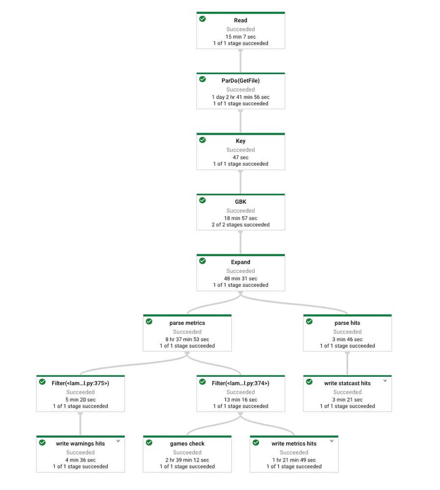
Dataflow provided a platform where we could design a single job (see details in image below) that would both backfill the six seasons of data needed as well as pull in new data from each individual game as the 2020 MLB season progressed. When we needed to backfill, we scaled up to hundreds of machines processing almost 2.5TB of data in around 150 hours of vCPU processing time, taking 30 minutes of wall clock time. When we needed to pull in only two League Championship Series games, this could be done on a single machine in a matter of minutes.
The result of this process was a number of tables in BigQuery containing all historical Statcast data, updated each day during the MLB season. In addition to a single table with millions of rows and dozens of columns with Statcast data on each event, BigQuery tables involved in game note generation include team schedules, rosters, and probable starters, among others.
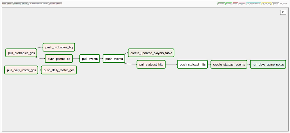
The daily orchestration of this data ingestion process was handled by Cloud Composer, Google’s fully managed workflow orchestration service built on Apache Airflow. Airflow is an open source platform used to programmatically build, schedule and monitor individual workflows. Once we had scripted a DAG (a collection of tasks to be run – one of Airflow’s core concepts), we could test it, run it, monitor performance and start debugging all in the Airflow UI, hosted by Cloud Composer. In the case of our daily ingest of MLB data, we have a 12-step process (see details in image below) that starts with pulling raw data from MLB API endpoints and finishes with notes like the example above.
Using BigQuery to go from data to insights
With data stored and updating in BigQuery, our next step was to turn that data into text-based insights that could form game notes. We could’ve created a large number of unique SQL queries that generate various stat leaderboards for use in game notes – e.g. one query for teams with the most hard-hit balls this regular season, one for pitchers with the highest average fastball velocity in the postseason, and so on. While that would work, we scaled up more robustly by making some generalizations across how many of these “stat leaderboard”-type notes are created, and by using some more advanced BigQuery features to reduce the amount of code complexity and redundancy required.
Most statistics leaderboards used here can be thought of as compositions of a few elements:
-
A statistic of interest, e.g. number of hard-hit balls or average fastball velocity
-
A time span that the leaderboard covers, e.g. last 2 regular seasons or this postseason
-
An “entity” of interest, usually either teams or players
-
A “facet” of the game, representing which “side” of the ball to calculate certain stats for, e.g. hitting or pitching
-
A ranking qualification criteria, which represents a minimum # of opportunities for a stat to be reasonable for ranking (mostly used for player “rate” stats where a small denominator can lead to outlier results, like a .700 batting average over 10 at-bats).
Each of these composable elements can be separated out as different “ingredients” to be used in various combinations to generate leaderboards. We created a single BigQuery view for each time span of, filtering the Statcast events table by date and game type. Each stat has several pieces of info related to its calculation (numerator, denominator) and display (various names and abbreviations, decimals, etc.) stored in a few “support” tables. Another key table lays out the elements to compose for each leaderboard – one stat, one span, whether to aggregate by teams or players, from the hitting or pitching perspective, and with what qualifying stat.
Our workhorse to process various combinations of those elements in a repeatable way is BigQuery’s scripting capability, which allowed us to chain together multiple SQL statements in one request, using variables and control statements. Stored procedures allow BigQuery statements in scripts to be modularized into separate pieces, as is often done in functional programming. BigQuery’s Dynamic SQL capabilities, which enable using SQL code to write SQL text to be subsequently executed by BigQuery, increase the scope of what can be done within those stored procedures.
Without these BigQuery features, we would’ve likely had to create the SQL text and call it from outside of BigQuery, in a language like Python or R. Doing so in the BigQuery environment itself eliminates the potential need to move data or business logic outside the warehouse, and increases code simplicity and consistency for those comfortable with using SQL.
We implemented a substantial amount of business logic in BigQuery to run hundreds of SQL statements to create more than 100 “parallel” stat leaderboards, add rankings (raw and percentile), and determine which players or teams deserve notes for each stat (usually, those at the extreme ends of a ranking). Another series of SQL manipulations turns individual leaderboard fields into the more actual text of a note – e.g. name “Randy Arozarena,” rank “1”, stat name “Hard-Hit Balls,” span “2020 Postseason,” entity type “Player,” and value “26” get combined into “Randy Arozarena ranks 1st in the 2020 postseason with 26 hard-hit balls (balls hit with 95+ mph exit velocity).”
Next, we add current team and player context to each note. The table accompanying certain notes uses BigQuery’s arrays in subqueries to filter each underlying leaderboard down, tag players with their current teams, and highlight the specific player the note is about within the table text. Notes for active players and teams are attached to each team’s next scheduled game. The automated version of our example note looks like this:

Very close to the original!
Scaling up note generation for notes that fit this paradigm is relatively straightforward. After adding 2020 postseason stats, we were able to create 150 notes per game during the League Championship Series – a tremendous increase from what is feasible manually, saving many hours of time.
We store all game notes in another BigQuery table with “metadata” fields for team, player, game, and more, allowing notes to be further filtered or manipulated in upstream processes. To facilitate consumption by MLB content and production personnel, game notes were surfaced in a more visually appealing and user-friendly Data Studio dashboard.
Surfacing the best game notes
Once the number of automated notes reached a certain volume, we noticed a challenge that was almost the opposite of the initial one: too many game notes to consider. Broadcasters and production crews are only looking for a couple key contextual insights to include in a telecast and could be easily inundated with too much information.
Being able to filter notes by the various fields mentioned above helps, but another feature we added was a “note score” that represented how “good” each note is. Since this is inherently subjective, our initial idea was to come up with various concepts related to how interesting or useful a specific game note might be, and figure out a data-driven way to measure each of them. The eight component scores that comprise the current note score metric are:
-
Stat Interest, incorporating extremeness (impressiveness) and direction of ranking (positive or negative)
-
Player Game Relevance, currently used to increase scores for notes on a team’s probable starting pitcher
-
Player Relevance, using a player’s various MLB honors (rated by relative prestige and recency) to rate some players as more relevant than others
-
Player Popularity, based on YouGov’s list of most famous contemporary Baseball players in America, as of August 2020
-
Team Relevance, based on FiveThirtyEight’s Postseason projections (chances to make playoffs and win the World Series) during the regular season, the same for every remaining team in the Postseason
-
Team Popularity, based on number of Facebook fans and Twitter followers of official team accounts (both per Statista), as of August 2020
-
Stat Type, representing how some stats are more broadly interesting/applicable than others
-
Stat Span, representing how stats involving more recent spans are likely more interesting/applicable than those involving older seasons
Our “final” note score is a weighted average of these component scores, with the highest weighting by far on Stat Interest, and then relatively high weights on Player Game Relevance, Player Relevance, and Stat Span. In the MLB-facing game notes dashboard, we took advantage of Data Studio parameters to allow users to enter their own weights to create a “custom” note score, enabling their own ranking of notes across games.
There is admittedly a lot of subjectivity in the way each of the note score components are measured and how they are weighted. Without an objective way to measure note quality, we’ve in some sense put in placeholders for the purpose of prototyping the system. In the future, consumers of the notes could mark their perceived quality or even simply track if they were used on broadcasts or not. This “labeling” could then provide data for a supervised machine learning problem, where past notes could be used to predict the perceived quality or likelihood of usage of new notes, allowing for more actual result-driven note scoring.
That said, the main takeaway is that having a note score, even in its current form, generally helps separate better game notes from worse ones. This helps the MLB production and content teams focus their limited time and attention to notes more likely to have impact.
Putting it all together and building for the future
By encapsulating the BigQuery pieces for leaderboard creation, note generation, note scoring, attachment to games, and preparation for the dashboard into a series of views and stored procedures, our daily note generation process is run with a few short SQL statements. As we mentioned, this code runs at the end of the Cloud Composer pipeline referenced above, so that game notes are generated right after Statcast data is updated in BigQuery each morning during the season.
To recap, MLB uses Google Cloud’s suite of data analytics tools to create automated game notes at vastly increased speed and scale. Using Dataflow to capture Statcast event data from the last six seasons and daily going forward, BigQuery to compute statistics and add appropriate context to turn them into textual notes, and Cloud Composer to orchestrate the daily data ingestion and note creation pipeline, hundreds of insightful game notes are surfaced daily for consideration by the MLB content and event production teams.
While stat leaderboard-based notes may represent the most readily scalable category of notes, there are of course many other types of game notes we could create automatically: player- or team-specific highs and lows, single outlier events, and matchup-specific notes involving players on two teams facing off. Another future direction of high interest is to create near-live in-game notes, providing context to events on the field seconds after they take place.
For all that and more, stay tuned for more exciting collaboration from the MLB-Google Cloud partnership—we have plenty “on deck.” But for now, enjoy the 2020 World Series!
Major League Baseball trademarks and copyrights are used with permission of Major League Baseball. Visit MLB.com.
Read More for the details.


